
 (320 x 40 px) (6000 x 750 px) (3)")
 (320 x 40 px) (6000 x 750 px) (3)")


Ever wonder why some homes look effortlessly polished while others feel like something’s missing? The difference often comes down to styling. Shelves, consoles, and coffee tables might seem like small details, but they’re the finishing touches that bring personality and flow into a room. I’m going to teach you how to style shelves, consoles, and coffee tables so they look polished instead of cluttered.
Here’s a little secret: it doesn’t just come together perfectly on the first try. Even seasoned designers will place something, step back, squint at it, and then move it around three more times until it feels right. Styling is a process of trial and error, so if you don’t love your first attempt, that’s completely normal. The key is knowing the design principles that guide your decisions.
The good news: once you understand concepts like balance, scale, and visual weight, you’ll start to see why professional photos look so polished—and you’ll be able to recreate that same magic in your own home.
Styling Principles Every Designer Uses
The Rule of Threes
Odd numbers (especially threes) feel more natural and visually pleasing than pairs. Place three objects together: a tall vase, a medium candle, and a small decorative bowl, and they’ll instantly look intentional.
Triangular Arrangements
Think of your vignette as forming a triangle. A tall item forms the peak, while shorter items make up the base. This structure gives your styling movement and balance.
Balance Without Symmetry
Balance doesn’t always mean matching. You don’t need two identical lamps to make a console feel right. Instead, aim for equal visual weight. For example, a large lamp on one side can be balanced by a stack of books with a plant on top on the other.
Visual Weight
Visual weight is how “heavy” or dominant an object looks in a space. Dark colors, bold shapes, and larger sizes feel heavier; lighter colors, airy materials, and smaller objects feel lighter. For example, a chunky black vase will feel visually heavier than a clear glass vase of the same size. When styling, distribute visual weight evenly so one side doesn’t feel like it’s tipping over.
Scale and Proportion
Always think about how objects relate to each other and the surface they’re on. Tiny décor on a large console looks lost, while an oversized sculpture can overwhelm a narrow shelf. Mix large, medium, and small pieces, but make sure they’re proportionate to the furniture.
Layering and Depth
Avoid the flat “lined up” look. Layer objects by placing smaller pieces in front of larger ones, or overlapping frames and books. This gives your display dimension and interest.
Texture, Contrast, and Juxtaposition
Texture adds depth. Contrast makes things pop. Juxtaposition highlights differences. For example: pair a rustic wooden bowl with a sleek marble tray (contrast), or put a delicate glass vase next to a chunky ceramic sculpture (juxtaposition). These differences actually make each piece stand out more.
Negative Space
Don’t underestimate empty space. White space (or breathing room) around objects is just as important as the objects themselves. It keeps your display from feeling chaotic and gives the eye a chance to rest.
How to Style Shelves
Shelves can quickly become dumping grounds, or overly staged. The key is balancing functionality with beauty.
Step 1: Anchor with Larger Pieces
Start by placing one or two visually heavier items on each shelf. Examples: a large art print leaning against the back, a wide bowl, or a tall vase.
Step 2: Add Layers for Depth
In front of your anchors, add medium and smaller objects: candles, small sculptures, or framed photos.
Step 3: Balance Visual Weight Across the Whole Unit
If you place a dark, heavy vase on the left side of one shelf, balance it with a lighter but still substantial piece on the right side of another shelf.
For an average bookshelf size:
- On one shelf, place a taller grouping on one side (like a vase or stacked books with a plant) and a shorter grouping on the other (like a candle and a small bowl).
- On the shelf above, switch it up. Try one long piece that runs horizontally, or flip the tall/short groupings so it feels different.
- On the third shelf, go back to the opposite of shelf one so you’re creating variety without chaos.
This zig-zag pattern keeps the eye moving and avoids that stiff “same-same” look. The overall effect feels dynamic and intentional, while still balanced.
Example Layout:
- Top shelf: Short grouping on left, tall grouping on right.
- Middle shelf: One long horizontal object (like a low wide bowl or a stack of books across the center).
- Bottom shelf: Tall grouping on left, short grouping on right (opposite of the top shelf).
Designer truth: Even with this formula, I’ll move things around until the whole unit feels right. Sometimes a shelf looks balanced close up, but when you step back, the visual weight needs tweaking. That’s normal, styling shelves is a process of adjusting and editing.
Erica’s Pro Styling Formula: Shelves
Here’s my go-to recipe for an average bookshelf size (adjust based on shelf length):
- 1 Anchor Piece (art print, tall vase, or large bowl)
- 2 Medium Accents (stacked books, candle, framed photo)
- 1 Small Layer (sculpture, decorative box, or small plant)
- Alternating Rhythm (switch sides or use a long piece on every other shelf to avoid repetition)
- Color Repetition (repeat 1–2 colors across shelves for cohesion)
- Negative Space (leave at least 25–30% of each shelf unfilled)1 Tall Grouping on one side (vase, plant, or art)
Let’s do a little practice with my office shelves and pinboard:
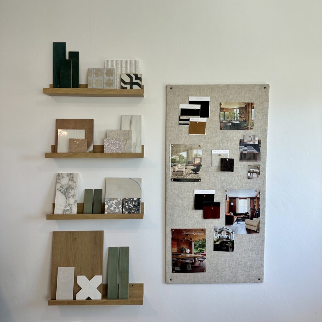
Now, these shelves aren’t meant to be styled perfectly—they’re more about function than form. But that actually makes them the perfect test! They give us a chance to spot what’s working really well, and what could be tweaked to make the styling stronger.
Think of it as a little styling quiz: before you scroll down, take a moment to look at the shelves and see if you can spot any areas that feel balanced, and any that feel a little off. Ready? Let’s break it down together.
What’s Working
- Alternating rhythm: Tall groupings on one shelf, shorter or horizontal groupings on the next, so the eye moves in a zig-zag instead of feeling stuck.
- Visual weight distribution (mostly): The largest/heaviest pieces (wood panel, marble slab, dark green tiles) are spread across the unit so no single shelf feels like it’s collapsing.
- Contrast and juxtaposition: Mixing smooth marble with speckled terrazzo, warm wood with cool greens, glossy tiles with matte finishes.
- Layering: Smaller objects are leaned in front of larger slabs; pinboard images overlap each other. This creates depth instead of flatness.
- Pinboard balance: The board anchors the whole vignette so the shelves don’t feel like they’re floating. Its linen background provides a calming neutral against all the strong materials.
- Negative space: Each shelf has some breathing room around the objects. Even the pinboard leaves linen showing, so it doesn’t look chaotic.
- Storytelling: These aren’t random objects, they’re materials, samples, and inspiration. It feels personal, not staged.
- Cohesion: The repetition of greens, wood tones, and stone ties all the pieces together into one unified palette.
What’s Not Working (and Why)
- Third shelf imbalance: The marble slab on the left is visually heavier than the terrazzo on the right, and the green verticals in the middle act like a divider instead of a connector. It breaks the triangular flow.
- Clustered weight: The darkest, heaviest pieces lean toward the left side overall, so the unit feels a little heavier on that side.
- Repetition of format: If this wasn’t meant to only house tile samples you could say that most shelves use the “leaned samples + small accent in front” formula. When thinking about traditional styling, when things are repeated on every shelf, it can start to feel predictable. A different shape (like a bowl, stack of books, or sculptural piece) would add variety.
- Limited layering on some shelves: A few objects sit more side-by-side than overlapped, which makes those shelves feel flatter compared to the stronger layered ones.
- Pinboard disconnect: While it balances the shelves, it reads a bit like a separate element (because it is in practicality). Echoing the color from the board into the shelves would tie them together even more.
- Crowding on middle shelves: The second and third shelves are a little busier than the top and bottom. Removing one piece from each could open up more negative space and calm the eye.
Teachable Moment: Fixing the Third Shelf
Now, let’s look at the third row from the top. Even though it has great materials, it feels a little off compared to the others — and here’s why:
- The marble slab on the left is very visually heavy (large, bold veining, commanding presence).
- The terrazzo on the right is smaller and lighter, so it doesn’t fully balance the marble.
- The green verticals in the middle aren’t helping — they cut the shelf in half instead of creating a smooth triangular flow.
- Altogether, the eye doesn’t know where to land, so it jumps back and forth between marble and terrazzo without rest.
How to Fix It
There are a few easy adjustments that would instantly improve this shelf:
- Balance the weight: Replace the terrazzo with something taller or darker so it visually matches the strength of the marble slab.
- Move the greens: Instead of standing in the middle, layer the green samples in front of the marble or terrazzo. This creates depth and removes that dividing line.
- Edit for space: If it still feels busy, pull one piece off. Giving objects more breathing room often makes the whole arrangement calmer.
- Rebuild a triangle: Place the marble as your tall anchor, use the greens and terrazzo as mid-height, and add a smaller piece at the front. That triangle shape gives the eye an easy path to follow.
The Big Lesson
These shelves work because they showcase principles like rhythm, contrast, layering, and negative space. But they also prove that styling doesn’t need to be perfect to be effective. Sometimes imbalance, repetition, or crowding creep in, and that’s okay. The key is to notice what feels off, adjust one or two things, and keep moving pieces until the whole composition feels balanced.
How to Style Consoles
Consoles often live in entryways, hallways, or behind sofas. They set the tone for your home, so their styling matters.
Step 1: Anchor with Art or a Mirror
Hang a mirror or art above the console. This acts as your main visual anchor and draws the eye up.
Step 2: Add Height at the Ends
Place a tall lamp, vase, or sculpture on one end. This creates vertical balance and frames the space.
Step 3: Use the Center as a Middle Ground
Add something lower in height in the center: a tray with candles, a stack of books with a decorative object, or a low bowl.
Step 4: Balance Visual Weight
If you have a heavy lamp on the left, balance it with several medium objects on the right instead of another identical lamp.
Example:
- Left side: Tall ceramic lamp with a linen shade.
- Center: Low wooden bowl with keys and small trinkets.
- Right side: Stack of three design books topped with a small plant in a clay pot.
Here, the lamp has heavy visual weight, but the books plus plant balance it out.
Designer truth: I’ll often style a console, walk away, then come back an hour later and swap sides or remove a piece. Consoles are all about balance, and sometimes you only see what’s “off” once you step back.
Erica’s Pro Styling Formula: Consoles
- 1 Anchor Backdrop (artwork or mirror above console)
- 1 Tall Object (lamp, vase, or sculpture at one end)
- Center Grounding Piece (tray, bowl, or stacked books)
- Balancing Grouping (books + plant + decorative accent)
- Personal Touch (framed photo, travel keepsake, or candle)
3. How to Style Coffee Tables
Coffee tables are the hardest working surfaces in a living room. They need to be practical but still look polished.
Step 1: Start with a Tray
A tray anchors your display and keeps small items from looking scattered.
Step 2: Stack Books for Structure
Add two or three large design books. Place them diagonally to the tray or opposite it for balance.
Step 3: Add Something Sculptural
Use an object with presence—like a chain link, a carved bowl, or a chunky candle.
Step 4: Layer in Greenery
Even a small vase with branches instantly breathes life into your coffee table.
Step 5: Balance Visual Weight with Functionality
If your tray has multiple heavy objects (dark candle, bold sculpture), balance with something lighter on the other side—like a glass vase or a clear bowl. Always leave empty space for cups or remotes.
Example (Rectangular Coffee Table):
- Left third: Round rattan tray with a dark candle, a small ceramic bowl, and a stack of coasters.
- Middle third: Stack of three coffee table books with a sculptural chain link on top.
- Right third: Glass vase with leafy branches, leaving breathing room for mugs.
Designer truth: I never expect a coffee table to look “done” after one try. I’ll move the tray slightly, swap the vase for a bowl, or rotate the books. Tiny shifts often make the biggest difference.
Erica’s Pro Styling Formula: Coffee Tables
- Tray Anchor (to corral items and keep them grounded)
- Stack of Books (2–3 coffee table books as base)
- 1 Sculptural Accent (bowl, chain link, or candle)
- Organic Element (greenery or fresh flowers)
- Breathing Room (leave ⅓ of the surface open for function)
Common Styling Mistakes
- Using only small décor (looks cluttered and insignificant).
- Forgetting visual weight (everything heavy on one side feels lopsided).
- Ignoring negative space (crowded arrangements look messy).
- Sticking only to symmetry (balanced but boring).
- Forgetting function (coffee tables still need room for real life).
Putting It All Together
Styling isn’t about perfection, it’s about practice. Even professional designers rearrange and tweak until a surface feels balanced. It rarely looks “right” on the first attempt. The difference is, they know the principles to guide their adjustments.
If you’ve been wondering how to style shelves, consoles, and coffee tables so they look intentional instead of cluttered, the answer is simple: rely on the design principles we covered; balance, visual weight, scale, layering, contrast, and negative space.
By applying these rules, you can transform everyday surfaces into beautifully curated moments that reflect your personality. And remember: styling should be fun. Move things around, live with them for a few days, and don’t be afraid to break the rules once you’ve learned them. The more you play, the more confident your eye becomes.

 (320 x 40 px) (6000 x 750 px) (3)")
")
+ show Comments
- Hide Comments
add a comment